Hello! Ten things about me:
1. I’m a strong thinking partner and creative problem-solver. I’m highly conceptual, creative and strategic, so I can work successfully with either a marketer or a (visual) creative director.
2. I can give you the luxury to react. I know you’re busy, with a back-to-back schedule. I can advance things even when a check-in doesn’t happen or you haven’t had time yet to think of starter direction. I’ve worked without briefs before. I have a can-do attitude and an ability to solve. I can think about things for you. I can make you look good in meetings.
3. I can take things from here to there. Or, if you have starter direction, I can take it to the next level for you.
4. I can fix things. I’ve been brought in as a ‘fixer’ before. When a project is in trouble, I can reliably deliver solid solves.
5. I’m zeitgeisty and up-to-the-moment. I get what’s going on culturally, and I often weave that into my work so it’s truly relevant. I’m well-read—but not in a jaded, know-it-all kind of way. I come to things fresh and lightly. I’m not one-dimensional in my thinking. Nothing is surface with me.
6. I craft beautiful messaging at the highest level. I write in different voices to suit individual clients, but I don’t do anything that isn’t best-in-class...or else I won’t be able to sleep! (Flashback: When I was a kid, I won a lot of 'Most Dedicated' awards.)
7. I’m highly energized. I add a certain emphatic-ness to the thinking and writing process. I always have some thought to contribute to the mix, and I’ll be excited when I do it!
8. I bring a light, buoyant spirit to working with you. I operate with a certain joie de vivre! I’m generally positive, happy, and bright—in both senses of the word. These personality traits mean that I plug in well—with marketing departments, in-house creative teams, agency teams, or even other copywriters.
9. I like mentoring talented people. Speaking of other copywriters… some companies have hired me to help train their in-house writing staff, or to help get a new editorial director up to speed. I love doing this! I’ve been told many times that I’m a natural teacher.
10. I can help you hire full-time editorial. I’m not a recruiter, but some clients have used the branding work they’ve done with me as a tool to help them find ongoing full-time hires. I don’t mind this at all. I’ve even helped create edit tests and evaluate candidates. When you have a clear vision and a style guide for a role, it makes it that much easier to select the perfect person to bring it all to life!
BRAND STRATEGY
(cultural research; story research; thought partnership pre-brief and on 360 strat plans; story-driven competitive research; cultural research; mission statements, value propositions, etc)
BRAND STORY
(story-driven, deeply thought-out creative concepts; elevator pitches; brand positioning, promise, platform, pillars, etc)
BRAND VOICE
(voice filters, prompts, style guides; content strategies; brand-level execution, including campaign concepting, campaign 360 ideas, product concepting, loyalty program concepting, and naming / launch / romance copy, etc)
Piperlime brought me in to help them rebrand and relaunch.
I worked with Melissa Parker Hughes (Piperlime's creative director) and Kirstin Hornby (the head of marketing)—under Lexi Tawes (the VP / General Manager)—to concept a new:
1) Brand Positioning (including a tagline and Value Proposition, among other elements)
2) 'Elevator Pitch'
3) Brand Promise
4) Brand Voice
5) Approach to Product Photography
6) Approach to Fashion Photography
7) Content Strategy
8) Relaunch Campaign Concepts
Please find a breakdown of these projects in the following eight tiles.
I'd also like to share a special thank you to Melissa, Kirstin, and Lexi for their inspiring leadership—and to the women of True Story, who came in to consult on our work at several intervals.
A lot of clothing retailers do a variation on 'passion for fashion' as their positioning. Piperlime wanted to find a new space. I thought about their business and their customer through a few different lenses, proposed several possible new directions, and then worked with the leadership team to finesse and refine them.
I can't actually share the winning positioning statement as it's only for internal use, but it revolves around the idea that Piperlime isn't just about fashion...it's about your life when you're wearing the fashion. It has a positive, motivational energy—designed to prompt customers to snap something up, and then live it up. We centered in on the word 'chic' because it speaks to fashion...but also to lifestyle, confidence, effortlessness. After all, getting dressed is only the beginning.
All of this meant we needed to think about how the Piperlime customer lives now—and we saw that we needed to incorporate social media into the shopping experience.
But it wasn't actually that simple. We needed to think about Piperlime in a totally different way. It couldn't be a destination or even a place anymore, as social inspiration can come from anywhere and everywhere. It had to be more of an epicenter, a hub, a connection that links social inspo directly to a perfectly curated selection of the best fashion...and then invites the customer to be the next bit of inspo.
The final tagline? Your connection to chic.
Click the links here to read our press:
After we finished the positioning, we realized we needed an 'elevator pitch'—a short one-liner that would not only help explain the rebrand to customers, but that could also act as a working filter for internal teams as they brought the new brand to life. I wrote this, and we all agreed that its sharpness and clarity solves for both purposes.
Piperlime: Like shopping the social feeds of the girl who always gets it right.
As we started to bring our work to life, I started to work on what our brand promise could be, just as Melissa Parker Hughes (Piperlime's Creative Director) shared her vision for the photography.
I remember looking at her boards, and feeling very inspired by her energetic, upbeat shots. They were equal parts fashion and lifestyle. And they had a certain intimacy to them—even though they all seemed like the woman in the shot had intended them for public viewing. They each told a simple but complete story, every one a little vignette or moment.
And then it just came to me: Moments of Chic / #momentsofchic
We all liked it so much, we've made it customer-facing. I also wrote a variation about Piperlime's customers that is also used sometimes: Girls Who Chic / #girlswhochic
I concepted 'StyleFeed', a page anchored in the main Navigation bar that collects all of the Moments of Chic and makes them directly shoppable. Piperlime creates some of the moments themselves, but others are submitted by the Girls Who Chic. (If Piperlime doesn't sell any particular item, it just suggests something similar.)
Personally, I find perusing StyleFeed to be rather addictive. :)
For the copy voice, I didn't have to look further for inspiration than the social feeds that Piperlime's customer would most admire.
One interesting twist, though: We realized we could move away from the "we" voice that's now so common in ecommerce. (We're loving x, we're obsessed with y, etc.) The 'online retailer as magazine editor' construct started with the birth of ecommerce, and has now become omnipresent (and a bit overused) in certain segments of the market.
The visual style is entirely that of Melissa Parker Hughes, Piperlime's wonderful Creative Director. My contribution was merely to suggest that perhaps product-only shots also have lifestyle-y emotion. A feeling or an energy that seems to match that of the actual item.
Here, a pair of airy white ankle boots takes a free-spirited trek through San Francisco. A pair of pumps decked out in dark glamour ends their evening somewhere they shouldn't be. A fringed bikini pairs off with gladiator sandals and sunnies and lies around somewhere, probably poolside.
I was inspired by a visit to Piperlime's store in NYC. I remember staring at a killer pair of black stilettos, and pivoting one of the shoes out to one side. It made me think an invisible dominatrix was standing inside, and she was about to start tapping her foot angrily because someone dared be late. It made me want to buy them!
Again, the imagery is Melissa Parker Hughes' vision. My work here was just in helping to translate that vision to working filters for the Style Guide. These filters include:
Our girl is polished, our photography is not
Tasteful not Precious
Feminine not Girlie
Optimistic not Giddy
Put-together not Fussy
Etc
I concepted a full content strategy—or messaging framework—of ownable franchises that can be used omnichannel. More will rolling out in the coming months, but a few kicked off with the relaunch. A highlight:
16HR STYLE. Eight hours of sleep leaves 16 hours of life. And the Piperlime girl in particular lives every minute of it. She doesn't just go from desk to dinner. She goes from morning cappuccino to midnight, and then posts it all up. It is possible for one outfit to work for every occasion—a breakfast with friends, a work meeting, a Lorde concert. This highlights Piperlime's styling expertise.
I concepted a full content strategy—or messaging framework—of ownable franchises that can be used omnichannel. More will rolling out in the coming months, but a few kicked off with the relaunch. A highlight:
#NOTEVENTRYING. Spot-on styling that still makes it look like you're, um, not even trying.
I concepted a full content strategy—or messaging framework—of ownable franchises that can be used omnichannel. More will rolling out in the coming months, but a few kicked off with the relaunch. A highlight:
ANATOMY OF AN OUTFIT. Specific, diagram-like advice for getting it right.
Piperlime wanted a simple, hard-hitting relaunch campaign—that put the site's new format and functionality front and center. So I wrote:
INTRODUCING [or WELCOME TO] THE NEW PIPERLIME—your connection to chic
Shop X Social Feeds
Shop X Style Inspo
Shop X IT Girls
Shop X Cool Designers
FROM NOW ON, THIS IS SHOPPING
I led a voice rebrand, campaign concepts, and content—all omnichannel. I also built a strong copy team from scratch. The Mission: Elevate the brand. Elevate the ideas. Elevate everything!
To rebrand Sephora's Store Opening campaign, I led concepting for "A Total Change of Face"—which, of course, featured lots of totally changing faces.
This campaign was so successful, it grew to become the lead statement of Sephora's rebrand overall—as the company's positioning went from cutesy / girlie to a much more elevated, distinctive space.
The new brand voice I created for Sephora can be summed up by these working filters: Curatorial, Creative, Chic, Clever, and Cool. My team and I sometimes called them The Five C's.
I was also always striving to flex Sephora's POV on all of its retail categories.
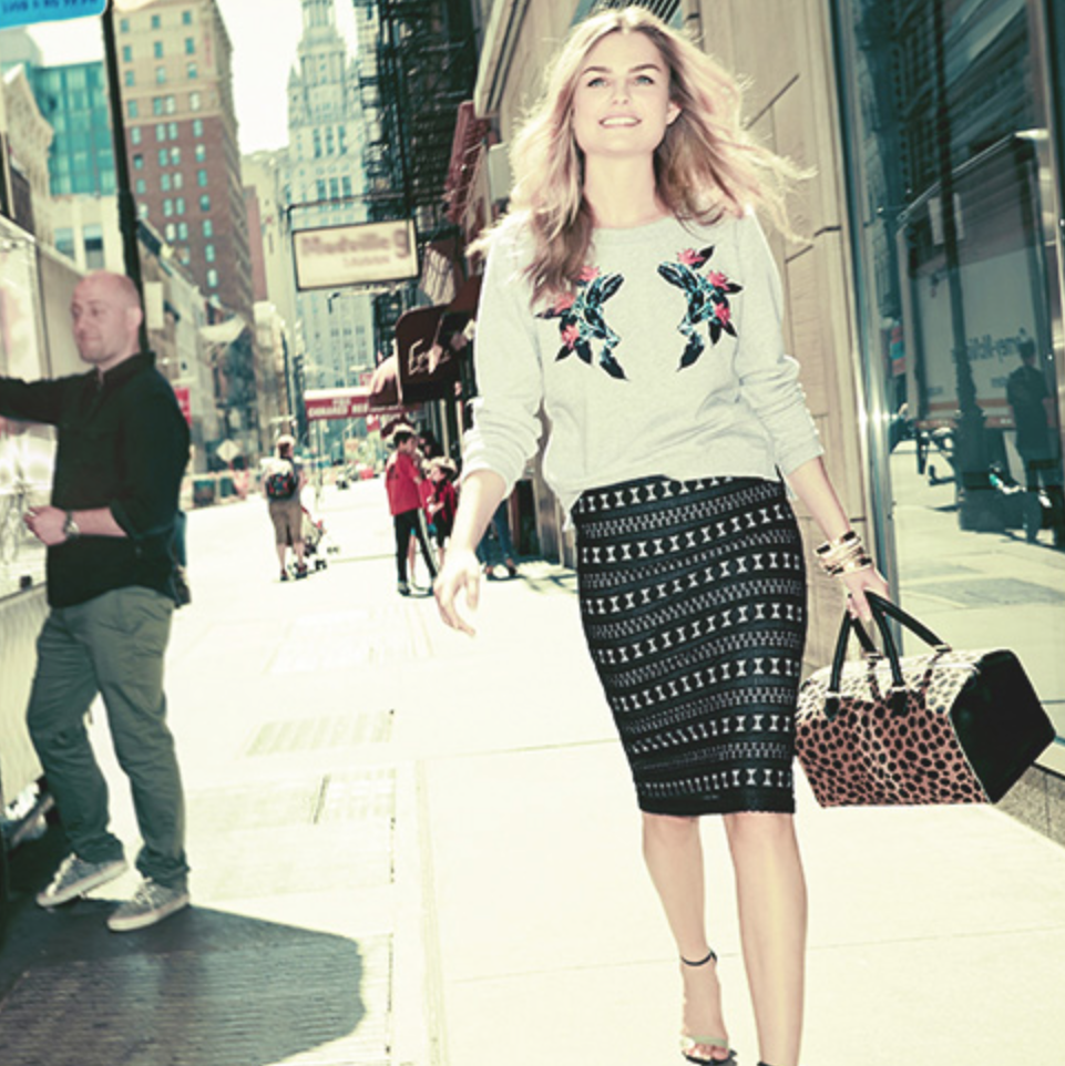
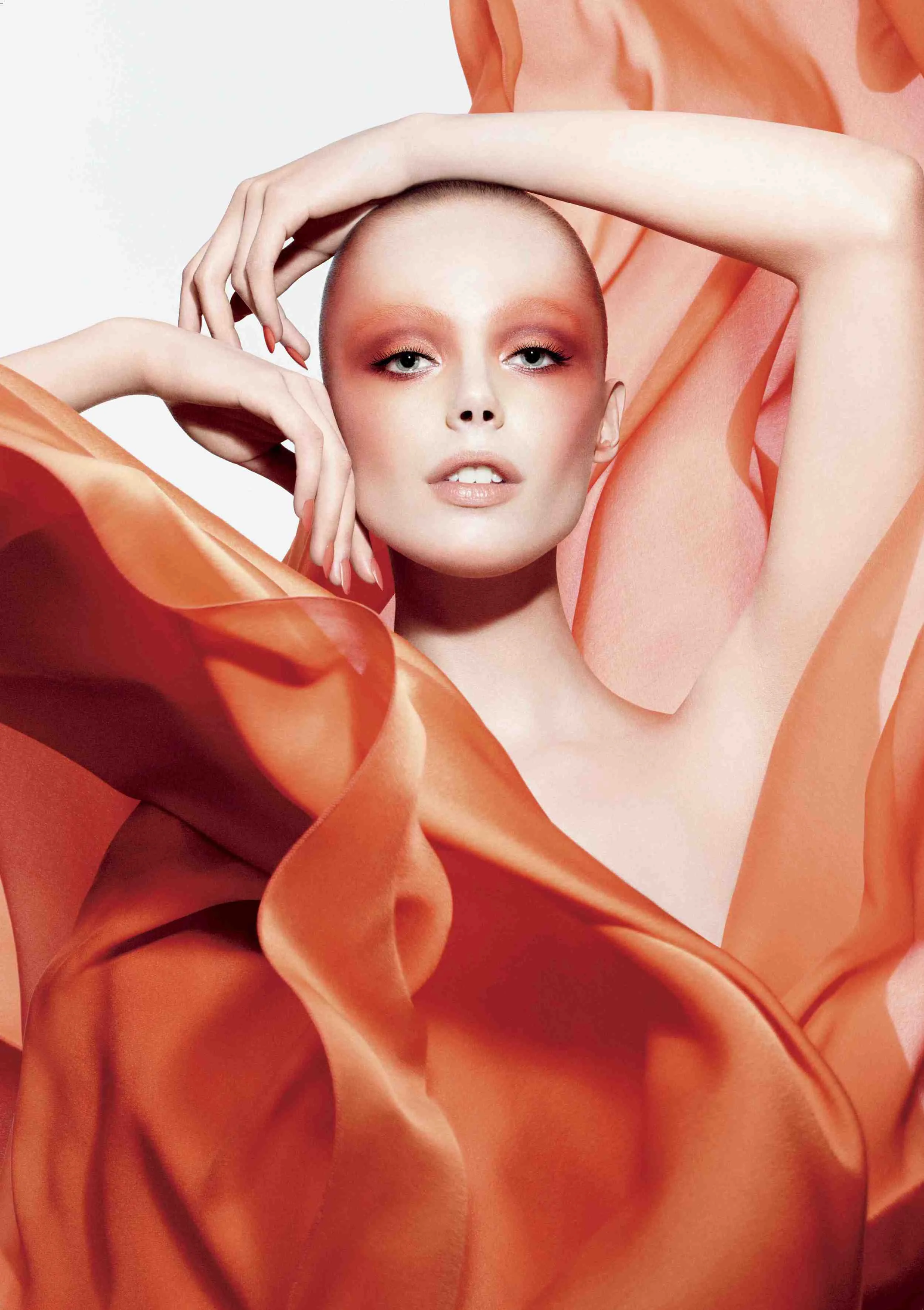
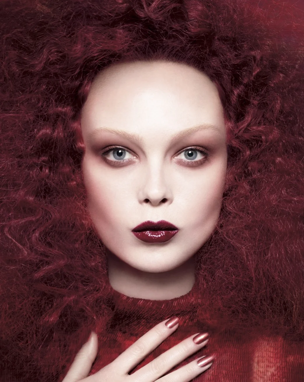
The objective for Sephora's website relaunch was pretty lofty: to rebuild the shopping experience. Naturally, Sephora wanted a killer rebrand and promotional campaign to match.
1. REBRAND: THE NEW FACE OF SEPHORA.COM_
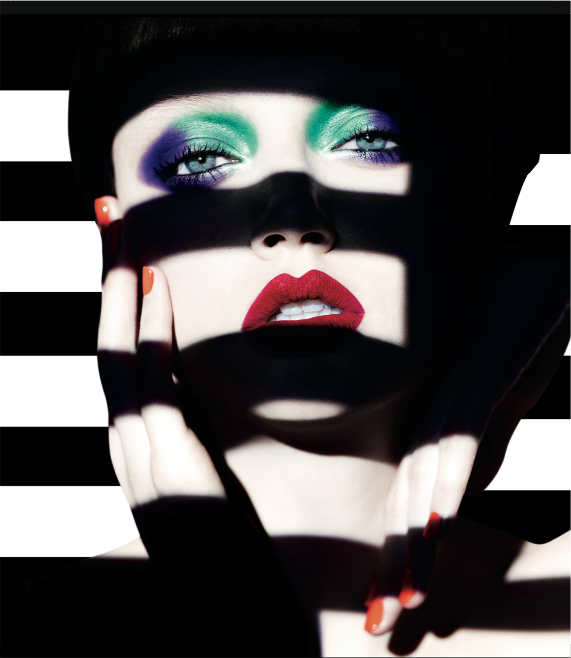
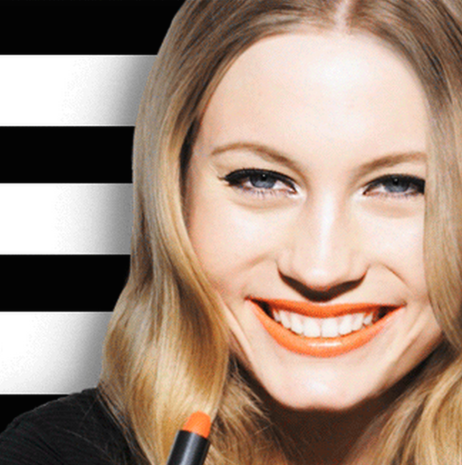
I led the development of a new e-commerce voice to coincide with the relaunch of Sephora.com. It fit in with my modern, elevated voice for Sephora overall, but it was adapted for digital. I wanted something more concise and straightforward—with a heightened sense of urgency and excitement. Short, snappy, cool, with a beat. Translation: A certain musical rhythm, with a lot of staccato notes.
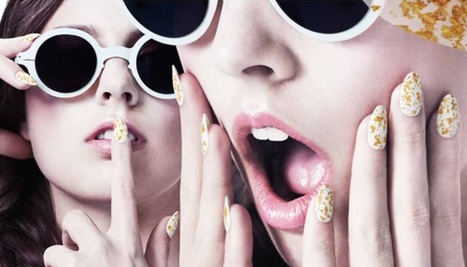
The same rhythm is represented visually in the Site Relaunch and the Promotion videos—lots of quick-changes, fast clips, stops and starts.
THE NEW FACE OF SEPHORA.COM_
Experience our Extraordinary Transformation_
SEE IT. SEARCH IT. LEARN IT. LOVE IT. SHOP IT.
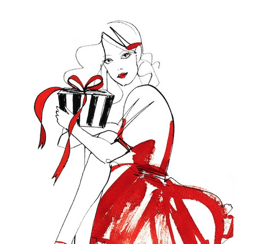
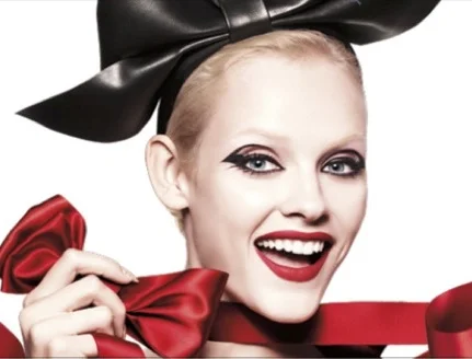
2. PROMOTION: 15 DAYS OF BEAUTY THRILLS
I also concepted the "15 Days of Beauty Thrills" promotion—where I felt that Sephora could "thrill" customers daily. There were 'Big Thrills' for some, consisting of a limited number of free trips, dinners with brand founders, and luxe giveaways. And then there were 'Mini Thrills' for all, made up of higher-volume, smaller-ticket items.
Celebrate the New Face of Sephora.com
15 DAYS OF BEAUTY THRILLS
Big Thrills for Some. Mini Thrills for All.
ENTER. WIN. BIG.
3. ONGOING BRANDING:
The staccato rhythm (often double-barreled) became an ongoing branded element of sephora.com. A few more examples still in use:
Spot it. Shop it. [Any Shoppable Moment. In heavy use. Also on the main bottom Nav of the site]
Get it. Gift it. [Any Shoppable Gift Moment, during Holiday]
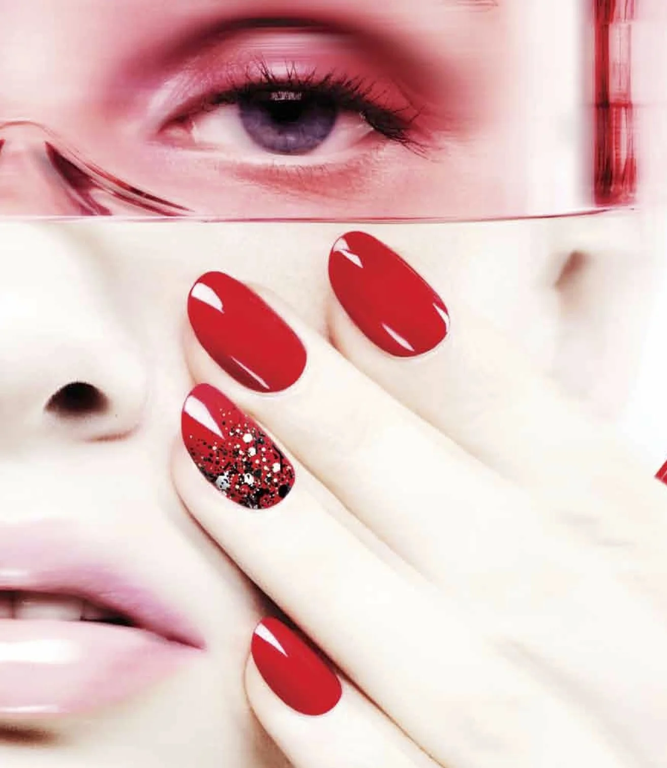
Tip it, Splash it, Pour it, Swipe it. [Used often for Nails: http://www.sephora.com/nails]
Read it. Live it. Love it. Crave it. [Used as a tagline for The Sephora Glossy]
Crave it. Covet. [Any covetable product—often high-end]
Etc.
To rebrand Sephora's Beauty Insider Loyalty Program, I created a positive take on Addiction, fed by a video game-like motivational strategy, whereby Sephora incited its junkies to level up their habits with rewards for ‘bad’ behavior. Each tier spoke from a more-addicted POV, and implied secret social clubs of people with shared habits. ("You're among friends"). Beauty AA in reverse.
Inspired by the customer’s frenzy for all things beauty (the counting-down to product launches, the hoarding behavior), I concepted ‘Beauty Hysteria' or 'Gifting Hysteria’. That developed into the creation of a special land—a store-within-a-store where everything goes. In ‘GIFTOPIA, Sephora’s MerryCrazyGiftingHoliday’, every single product is an instant gift. Motivational cues also urge customers to gift it forward.
Sephora’s customer often buys herself beauty treats around the holidays. So I led concepting for a Self-Gifting campaign (“CELEBRATE YOUR EXTRAORDINARY”), a la De Beers’ “Right-Hand Ring” work.
The company didn’t want to discourage gifting others, though, so I crossed that with an inspirational call-to-action to give others gifts hand-picked for their style/personality. The client—the extraordinary snowflake—was set within “A BEAUTIFUL BLIZZARD” of similarly sparkling individuals. A flurry of uniqueness.
The voice was bold, witty, and a bit saucy. The design was simple and bold, with flashes of individualist edge.
Struck by the mutual love affair between women and color, I came up with the concept ‘Enraptured’—which inspired the visuals.
When concepting the COLOR VISION franchise for Sephora, I found inspiration in their customers. Trolling through the Readers & Reviews section of sephora.com, I noticed that women were dissecting and discussing tiny differences in pigment gradation among lipsticks, shadows, and nail polishes. The customer's approach to color was actually highly sophisticated, so why not start telling stories to them the way they were already telling stories to each other?
The resulting Color Vision franchise tells a specific shade's story—in language and visuals. Sephora does some color forecasting to 'coin' the shade—building on its partnership with Pantone Universe and drawing on its position as a cultural influencer and industry authority.
The voice is more specific, richer, more nuanced. Crimson Velvet rather than Red. Lucid Lilac rather than Purple.
I concepted the editorial vision and voice for the launch of The Sephora Glossy. I didn’t think of it as a blog—and still don’t. Rather, it's a sales engine built around the notion that Educating and Engaging customers in just the right way will lead to purchases.
My overall concept was that Sephora doesn't cover beauty—Sephora is beauty.
Education Posts, therefore, convey Sephora’s authority and expertise in the most captivating, visual way possible. Engagement Posts are really Notes from the Epicenter of beauty: inside information, up-front moments with influencers, sneak peeks at products, etc. Many posts are actually micro-campaigns in and of themselves. All are designed to spark intent to buy—not merely to read.
For the Voice, I led the concepting of a templated structure of 'section' headers—each in a cool, modern voice. A few examples:
FRONT/CENTER (an up-front on anything)
CAMEO (A profile of a brand founder or industry maven)
EXTRA/ORDINARY ICON (any girl/woman of the moment)
BEAUTY CONFESSIONAL (our version of the Proust Questionnaire)
ZOOM IN (a magnifying glass on a product)
SPOT IT (a quick glance at a product)
FORMULA ONE (ingredient-led product story)
XRAY (a forensic autopsy of a product—ingredients, features, packaging)
HIGH FIVE (top five product lists)
BEAUTY PLAYLIST (what’s in a brand founder or staffer’s makeup bag, vanity, countertop, etc)
INNER WORKINGS (A behind-the-scenes look inside a brand
CATWALK/SIDEWALK (Runway to real-life)
IN THE TRENCHES (staffers being inspired)
P.O.B./POINT OF BEAUTY: Sephora staffers are at the point of beauty where they’ll try anything—bleached eyebrows, concealer lipstick, etc.)
LIVE LINK TO THE GLOSSY: http://theglossy.sephora.com
LINK TO ARCHIVE: http://sephora.tumblr.com/archive
The brief: An all-new nail polish brand born in the best nail lab in the world—with a significantly higher-grade formula than the rest of the market. Still, women like nail polish because it's fun—and probably won't respond to a hard science angle. The mission: Create the brand.
The concept: I immediately thought about cars. Specifically, how luxury sports cars are often presented as a perfect mix of performance and fun. And so, the tagline "Performance X Play" for Formula X was born. The visuals also carried that idea through of two elements crossing each other.
The voice: The language itself was also inspired by car storytelling. Specifically Porsche. Of all the luxury cars, Porsche seemed to me the most like Performance and Play. (Unlike Ferrari, for instance, which seems like Performance and Sex.)
Introducing FORMULA X, an uncompromising breed of bold lacquers that marks the NEXT IN NAIL. Boasting gel-like shine and unprecedented staying power, never-before-seen effects and an extraordinary range of standout shades, each swipe is a sleek declaration of limitless creativity—and unwavering confidence. With never a chip in sight, you are now free to revel in your supercharged life. Finally, the formula for play x performance, at your fingertips.
Coming soon
Sephora partnered with Disney on a launch of limited-edition beauty collections targeted to grown-up women, but still steeped in the fantasy. I led concepting where we retold classic tales, lifting the Disney princesses to adulthood and transforming them with a bold new spirit. In doing so, we encouraged women to not just imagine—but also live—their own fairy tales.
Coming soon
Coming soon
BRAND VOICE CONSULTANT / CONSULTING CREATIVE DIRECTOR, COPY. 2013 – PRESENT.
● Brand Voice / Concepts for Tory Burch's key categories: The creation of Beauty as a new category, ownership of the Tunics category, and more. (Under NDA).
CONSULTING EDITORIAL DIRECTOR. TORY BURCH. 2009 – 2010.
● Concepted franchises to develop Tory Burch's content channels. Creations included ‘Expert Guides’ (visual how-to lifestyle pieces featuring Tastemakers in cities where TB had boutiques) and ‘City Guides’ (travel guides, also featuring local tastemakers)—each with a Tory twist.
Coming soon
CONSULTING EDITORIAL DIRECTOR. AMERICAN EXPRESS CENTURION. 2009 – 2010.
● Launched app for American Express Centurion. My concept was to curate the world as if the cardmember lives above money…as if it doesn’t exist. Scope was broad—included shopping, travel, lifestyle, food, fitness, etc.
Coming soon
DEPUTY EDITOR / FEATURES DIRECTOR. ALLURE / CONDÉ NAST. 2006 – 2009.
● Overall: Created campaign-like themed specials and features to boost engagement and sales. Led content cross-channel. Led features team.
● Helped reposition Allure as a modern lifestyle brand: Concurrently, my work expanded Allure beyond beauty into on-brand lifestyle areas—which led to ‘Beauty Fusion’, a platform for general-interest advertisers. The first? Apple.
● Heightened Allure's authority in the industry: I amped up Allure’s beauty coverage to be truly authoritative—deep-dives, plus pieces that drove the industry to be more responsible / relevant. Approach was sciencey, but easy-to-understand.
SENIOR EDITOR. ALLURE / CONDÉ NAST. 2001 – 2004.
● Overall: I created Insiders’ Guide, which elevated the humble how-to and seeded Allure’s brand expansion beyond beauty. (Promoted from Associate Editor in Feb 2003).
DEPUTY EDITOR, BEAUTY + FASHION. COSMOPOLITAN / HEARST. 2004 – 2006.
● Overall: Created specials and features to spike engagement and sales. Elevated content, without losing brand cheekiness. Oversaw both the fashion and beauty departments.
● Modernized Cosmo's brand through beauty / fashion leadership: Anticipating the blog explosion, I led from a POV of what’s next (not what was). E.g.: I gave Rachel Zoe (at first Rosenzweig, then Zoe) a column just before she hit.
● Just for fun: Below, a shot of me (and a former coworker) with Helen Gurley Brown.
ASSISTANT EDITOR. GQ / CONDÉ NAST. 1998 – 2001.
● Overall: Contributed ideas and stories about fashion, travel, luxury, and lifestyle in GQ’s trademark dry voice. (Promoted from Editorial Assistant in June 1999).